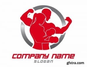
Before designing a brochure or website, i have started by designing a logo first and so i have researched some existing logos to gain a perspective on the compositions, colours and graphics. I had the idea of using silhouettes so looked at some logos that also use silhouettes. The red logo template shows a male and a female in the same composition showing that fitness is for men and women. The two colours red and silver are used which suggests power and iron. They’re not relaxing colours and so imply that the gym is about working hard to achieve goals. The second logo i looked at was Pure gym. They use blue and green and have a simple type faced logo. This logo suggests a friendly environment that you can join and work at your own pace as stated by their slogan ‘enjoy fitness’. Another logo i looked at goes back to the silhouette idea and uses red and black. Along the top are silhouettes of people working out showing a variety of fitness routines, therefore suggesting that there’s a variety of workouts that you can do at the gym.
Brief 3 research
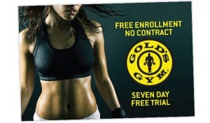
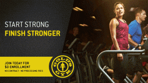
I have chosen fitnesse to respond to and so i have started off by researching existing gym brochures. The images below show some of the images i collected. They show power through the use of colour and the wording suggests that joining a gym is about building strength and becoming fit and so healthy, toned models are used on the brochures to portray this. I have started with looking at uni sex gyms just to get a broad understanding of the colours and composition that are generally used.
Evaluation
In the first brief I produced an art deco themed font which I gained inspiration from The Great Gatsby and the Art movement itself. Within this I made all 26 letters in upper case and then 6 letters in lower case. I did this because I found my font difficult to make into lower case and didn’t like the font in lower case letters. If had more time I would definitely spend longer on trying to make the curved edges smoother and neater. I would also present them a lot better as I feel they look messy due to their scales not being level. However, I was pleased with how the upper case letters came out as they look neat and are all accurate. It was a simple design but I feel it looks effective and works well when being used.
The second brief went better than the first in my opinion as the quality and quantity of work was done to a better standard. However, it got complicated at times due to working as a group as we had to decide who was doing what whilst making sure we’re all doing the same amount of work and answering all three parts of the brief. But it also had its benefits as it allowed us to bounce ideas off of one another to make the products better. We started out by researching Einstein’s theory of relativity and then looked into websites for children, to gain inspiration on style and layout. We started out by using existing graphics but then designed our own which made the piece look as though a young child had drawn them. This worked well as we wanted the target age group to be young children and so by having these graphics meant that the product was brighter and more appealing to a child. The project didn’t start coming together until the final drafts, I mainly worked on the website ideas and pitched in a few drafts for the app and poster before doing my own final page. Beth finalised the poster and Leah finalised the App. If I had longer I would probably change the website so that it was more of a game for children to learn on rather than a factual website. This is because I feel it needs to be more engaging. However, I think they all work well as the text to graphic ratio isn’t too heavy to put a child off but it’s also not too plain that it wouldn’t interest them. The app is my favourite from what we produced as I feel it’s the most vibrant and attractive. This is due to there being more graphics in the background and it’s quite compact, it looks busy in a good way, whereas I feel the website is a little plain in comparison. The poster finally, is also laid out well as the text is placed in an attractive design and contrasts the graphics nicely whilst demonstrating information through the use of graphics.
Second infographic idea
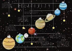
This is my second infographic idea and my last one, I am pleased with this one as i think it’s busy enough to be interesting to a child but it’s also not too much either. I am pleased with the layout of this one which I took inspiration from one of the posters i looked into at the beginning of the brief. I chose to line the planets up diagonally do they stretched across the page and i could draw information off of them. The stars were featured on the website but not the app and so I put them on the poster just to add more to it as I chose not to add the squares. I did this so that the poster looked different but still reflected the similar style. I feel that i have made use of any negative space, particularly with the stars. These infographics are my versions of ideas whereas our real one is featured on the blog above.
Infographic draft 1
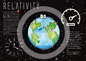
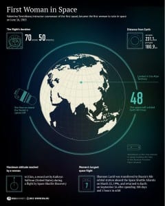
The screenshot below shows my first infographic, that I took inspiration from the poster also below. The theory involves time and speed being affected by mass and so I put two pictures on the infographic as well as planet Earth, i did this because on, Earth we have an idea of what time is whereas on another planet, time could be a completely different thing. I kept the infographic simple by making the Earth quite large and then having two columns of information each to do with speed and time which is why there is a clock and speedometer. I like this design as I feel it’s quite visually pleasing, however for a childrens infographic I feel like it needs to be brighter.
