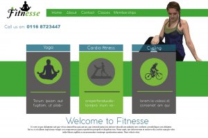
This is my first draft of a webpage, I wanted to use yoga poses as it’s a feminine workout and is all about connecting with the earth and feeling relaxed so to give this vibe, i used green and grey to suggest peace, earth and health. I cartooned the yoga pose on Photoshop to make it tie in the Wii fit research, however i feel this doesn’t work as well because it still looks realistic and grainy. The way i have positioned it doesn’t make it obvious that it’s a yoga pose, it just looks as the person is sat there. The positives of this layout are: the colours work well together and the layout is effective through the use of boxes and animations of each activity. The negatives are that the website seems boring and not modern almost, there is a large amount of negative space that could be filled either through the use of colour or by adding something else. Finally the logo featured is the old one and is also just placed in the corner, i feel like it could be placed somewhere better to make it more creative and interesting to look at.
Category: web page
Website research
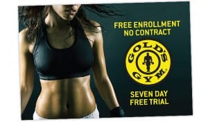
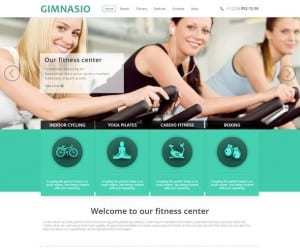
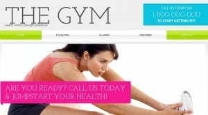
I have decided to create a web page for my female gym and so started off by looking at existing examples. The images below show some gym websites that i took off the internet for inspiration in terms of layout and colour. The websites i looked at use images as a main part of their website, for example usually people working out or posing in gym clothes. The text is incorporated through boxes and the use of a tab bar along the top followed by the logo. The colours that are used are bright tones of blue, pink, green and white showing health and giving the theme a positive bright outlook. From looking at the colour research i now know that these colours are used to advertise the gym in a positive way and so i will incorporate this idea into my designs. I also came across some designs that use black and gold instead of white, green and blue. These show more power through not only the use of colours but also the images used. For example the image below advertising Golds Gym display a healthy womans toned abs portraying her as a super fit and healthy, powerful woman. The model is also sweaty therefore showing this idea of power and strength, which is the impression we get through the use of the gold and black.
Example of webpage being used
Mars website page
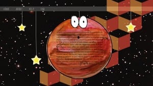
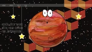
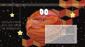
The three screenshots below show one of 6 pages from the website that me and my group produced. I started out by placing the tab bar at the top of the page to maintain a body on each page for the website. To make the background more interesting as to add more colour I made a pattern in Illustrator and used red and orange to match the colour of Mars and then turned down the opacity so it wasn’t too intense. I then placed mars central of the screen and strung him up again to again maintain the theme. The screenshots show the development of the text on Mars. I started out by placing it on the centre of Mars, however as group we thought that it was hard to read and so I decided to make it so that a box appears if you hover the cursor over the planet. I found that this makes the layout more interesting as well as interactive for the user. I made it so a white box appears which is big enough to read but is only there when you want to read the information therefore it does not always cover the main imagery of the page.
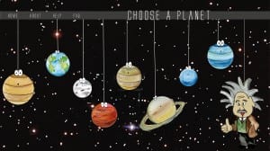
Final website front page
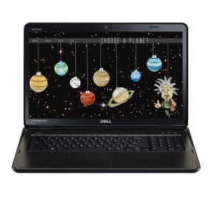
This is the final website front page that I produced, the layout is a lot different to the first one. After playing around with some layouts as a group we decided that this layout works best as the planets are also in the correct order as they appear are on the solar system therefore the idea is not only educating children on Einsteins relativity but also like the other website layout, the user chooses a planet with their mouse which takes them to another page telling them about the theory.. We also made the page look more like a website by putting a tab bar at the top with the option to get to the homepage. Finally the font is different on this layout, we chose more of a neat font to go with the space theme. I think this new font and layout looks a lot neater and more professional as oppose to the other one, the whole layout looks neater also and spaced out therefore cancelling out any negative space.
