Final designs

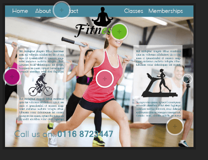
These are my final products, so the web page, logo, colour palette and a mock up of the business card. Overall i am pleased with my final design as i feel they reflect femininity, show good, effective use of colour and look legit. My favourite part to this project would be the logo, I feel this is the best aspect to this project and works well to achieve the image i want my gym to have. If i was to do this again i would spend more time making the website more unique and would capture my own images. I would also research in to some design skills that i could apply to make the logo work better, for example experiment more with vectors. I’m pleased with the colours as i think they compliment each other but also achieving the feel of health and strength without being too harsh or too cliche for females.

final logo web page 3first websitefitnesse business cards

Web page 4

This is another mock up i tried, I incorporated the first design with the third and added the boxes in with and image behind to see what it would look like. I think this works well however i feel the colours would look better if they were more blue to suit the background image. Though seeing this layout made me rethink and actually i prefer the third web page design out of the 4 i mocked up.

web page 4.jpg jpeg

Web Page 3

This is my third website page idea, I kept a similar layout to the previous one but made the main image slightly transparent so that it didn’t stand out as much. By doing this it draws more attention to the main logo in the, i also moved the position of the logo so that it’s in the middle of the page, therefore the most eye catching object on the web page. I made the banner at the top green because i feel that it’s a more positive bright colour, it also stands out from the photo wheres as the blue didn’t as much. I left the page to a bare minimal to create the impression that the two arrows at the side move you to another page, named at the top on the banner. I then added a welcome to fitnesse at the bottom with some placeholder text to show that, that is where the information you need is.

web page 3

Web page 2 colour palette

The colours for the second colour palette are more feminine colours such as two shades of pink, then the blue, green and brown. These colours are more cliche to women but don’t have the same connotations as the first colour palette does. Despite this point the layout of the colours aren’t in your face, they’re positioned in a subtle manner that works with the blue being the main accent colour.

web page 2 color palette web page 2 colour design