Second character sketches

These are the sketches for Lamby and the mother. I am pleased with these and so i am working with these. I am pleased with these as the Lamb is cute which is what i wanted him to look like and the mother looks like a female sheep which is important. The second photos show them coloured in, i couldn’t decide whether to colour them myself or to colour them in on Photoshop so i experimented with both, i used pencil crayon as that’s the look i wanted them to have, so i scanned them in to photoshop and brightened them using the curve tool so they’re not as dull. However i’m still unsure as to whether this works because they look different compared to the tree i created on Illustrator.

mummy lamb plain white second lamby Scan_20160328 (2) Scan_20160328

Experimenting

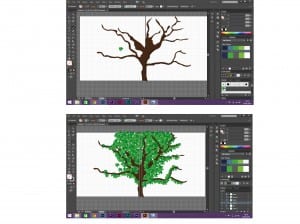
Due to a sheeps habitat mainly being in fields/countryside. I want my book to consist of lots of greens, fields, blue skies and colourful flowers. I have decided on this as it’s something that makes me feel happy, i used to love playing in fields as a kid and with lambs being my favourite animal, it felt right to make my story book revolve around this. I wanted to create as much of my scenery as i can on Illustrator so i can develop my skills in this software and so the image itself is sharper and more effective as oppose to drawing it myself and scanning it in. So the screenshot shows me having a go at drawing trees on Illustrator. I found a tutorial online that showed me how to create my own leaves and make it into a paintbrush, i found this made the process a lot easier and a lot quicker. I then found an image of a tree, used the pen tool to cut round the trunk and branches and filled it with my colour. Finally i then used my leaf brush tool i created to place leaves all over the tree. I like the design and especially the leaves so i will be using them in my final piece. However i feel the trunk needs to be bigger as i want it to stretch over the front and back cover of the book. I also want the Lamb to be featured on the front cover so it needs to be a bigger tree for the lamb to not look out of proportion. The screenshot below shows tree before and after i applied the leaves.

tree

Experimenting with colours

These four logos show the experimentation of different colours, I originally chose a green but then changed to using a blue and a peach to experiment with more pastel colours as they feel more feminine. However i have decided that i prefer the green because it not only suggests health but it’s a vibrant colour. I also tried a more enhanced orange/peach colour to see if that would make a difference which is a good potential for the final logo colour. The peach i chose works because it resembles a skin tone which ties in with the yoga pose above the font. Finally I experimented with a pink, but i soon decided that this did not work because it is too stereotypical for a female gym.


logo different colour logo with pink logo with peach logo different colour green logo different colour bluer logo different colour blue

Second infographic idea

This is my second infographic idea and my last one, I am pleased with this one as i think it’s busy enough to be interesting to a child but it’s also not too much either. I am pleased with the layout of this one which I took inspiration from one of the posters i looked into at the beginning of the brief. I chose to line the planets up diagonally do they stretched across the page and i could draw information off of them. The stars were featured on the website but not the app and so I put them on the poster just to add more to it as I chose not to add the squares. I did this so that the poster looked different but still reflected the similar style. I feel that i have made use of any negative space, particularly with the stars. These infographics are my versions of ideas whereas our real one is featured on the blog above.

infograohic 2