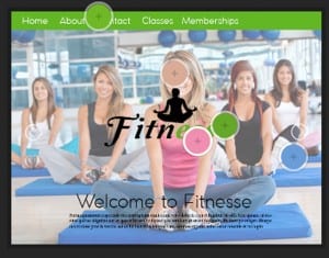
This is the third colour palette which features pink, skin tone, two greens and a blue is a more feminine palette in comparison to the others, however it is not my favourite because i don’t think the colours work nicely on a palette. Although despite this, i like how the peach works with the pink and greens. 
Category: web page 3
Web Page 3
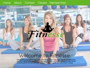
This is my third website page idea, I kept a similar layout to the previous one but made the main image slightly transparent so that it didn’t stand out as much. By doing this it draws more attention to the main logo in the, i also moved the position of the logo so that it’s in the middle of the page, therefore the most eye catching object on the web page. I made the banner at the top green because i feel that it’s a more positive bright colour, it also stands out from the photo wheres as the blue didn’t as much. I left the page to a bare minimal to create the impression that the two arrows at the side move you to another page, named at the top on the banner. I then added a welcome to fitnesse at the bottom with some placeholder text to show that, that is where the information you need is.

