 This is how the home page of the website would appear if it was to be published and used. I am happy with how this looks as it fills the whole screen and everything is clear and visible.
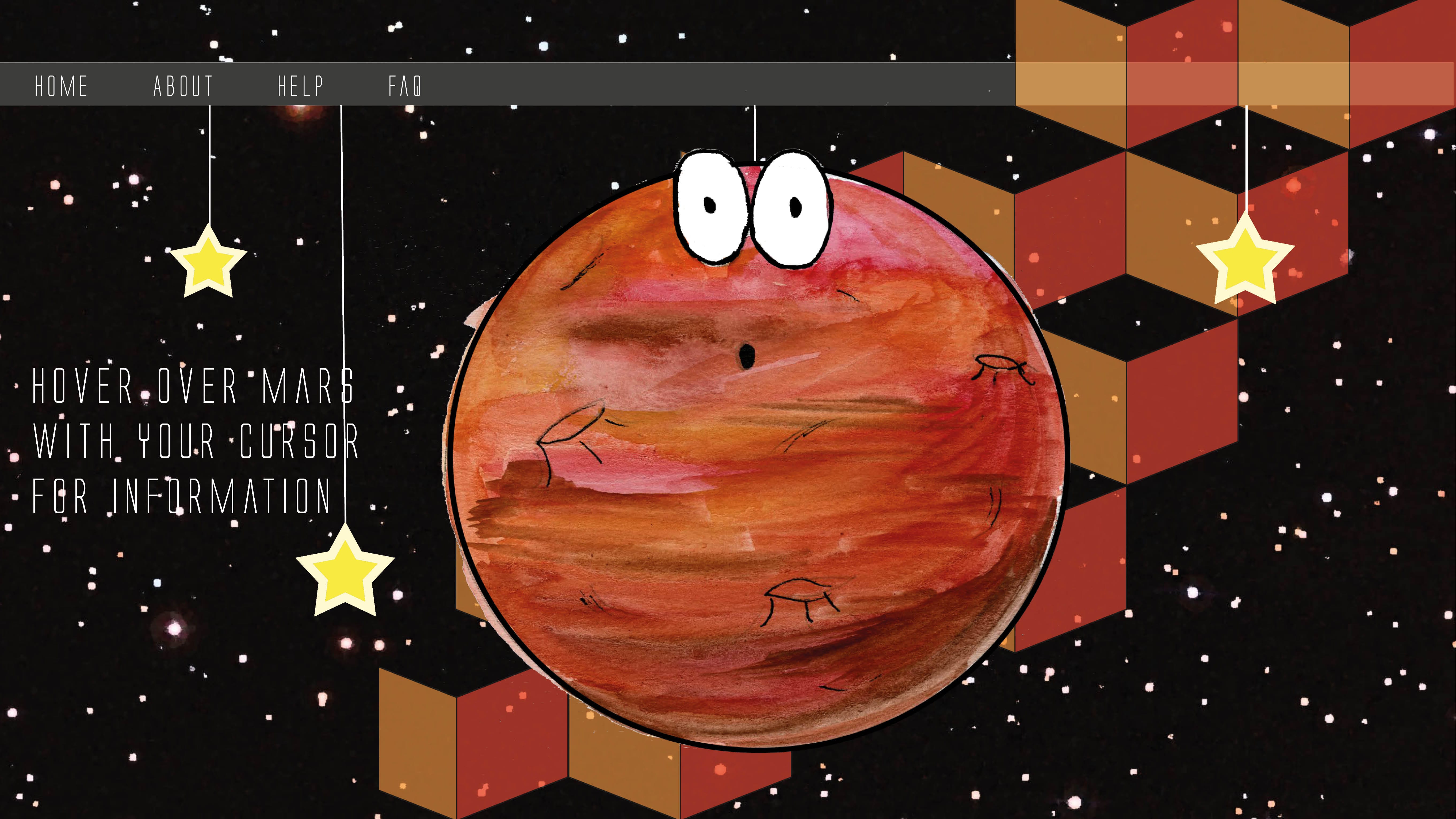
Mars website page
The three screenshots below show one of 6 pages from the website that me and my group produced. I started out by placing the tab bar at the top of the page to maintain a body on each page for the website. To make the background more interesting as to add more colour I made a pattern in Illustrator and used red and orange to match the colour of Mars and then turned down the opacity so it wasn’t too intense. I then placed mars central of the screen and strung him up again to again maintain the theme. The screenshots show the development of the text on Mars. I started out by placing it on the centre of Mars, however as group we thought that it was hard to read and so I decided to make it so that a box appears if you hover the cursor over the planet. I found that this makes the layout more interesting as well as interactive for the user. I made it so a white box appears which is big enough to read but is only there when you want to read the information therefore it does not always cover the main imagery of the page.


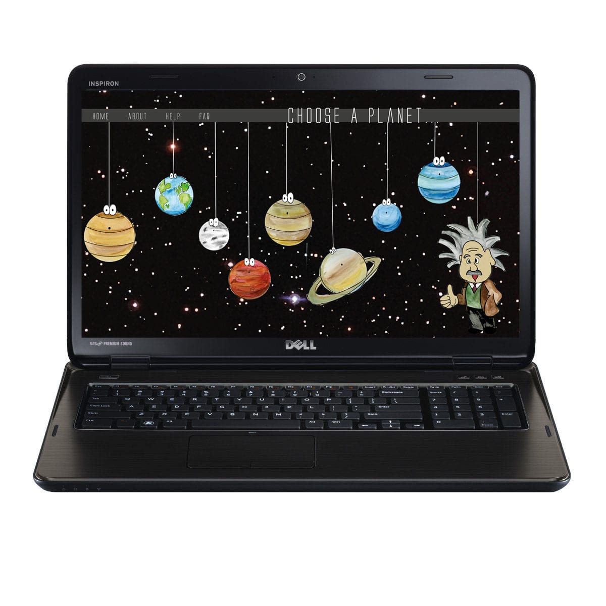
Final website front page

This is the final website front page that I produced, the layout is a lot different to the first one. After playing around with some layouts as a group we decided that this layout works best as the planets are also in the correct order as they appear are on the solar system therefore the idea is not only educating children on Einsteins relativity but also like the other website layout, the user chooses a planet with their mouse which takes them to another page telling them about the theory.. We also made the page look more like a website by putting a tab bar at the top with the option to get to the homepage. Finally the font is different on this layout, we chose more of a neat font to go with the space theme. I think this new font and layout looks a lot neater and more professional as oppose to the other one, the whole layout looks neater also and spaced out therefore cancelling out any negative space.
Website page layout idea

This was the first finished front page idea using the new graphics that we made ourselves. The planets are strung up from the top, which is inspired from the little big planet research. The idea behind this website page is that the user selects a planet using their mouse which then takes them to a new page depending on what planet they choose. The title at the top is suppose to look as though it has been handwritten on a piece of paper which has then been ripped off and placed on the website by Einstein as the font is the closest one I could find to Einsteins writing.
First website layout

This was the start of the first layout for the website, however I did this using the old graphics taken from the internet and so I didn’t carry on with this design because we chose to produce our own graphics.