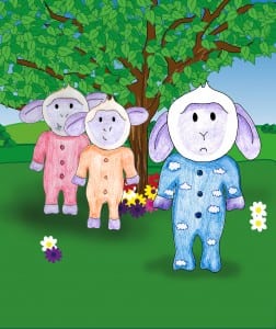
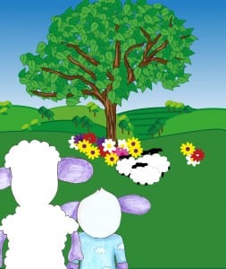
This is the 5th page inside my book that shows Lamby sad after being laughed at by the other lambs because he got the colour of their onesies wrong. He is feeling sad because he knows he is different and can’t understand why, he wants to be just like all the other lambs therefore showing that he hasn’t realised that it’s okay to be different. This is one of my favourite pages as you actually feel sad by the drawing i have done of lamby looking really down. I also think the layout works because it looks as though the other lambs are intimidating Lamby. The colours work well together and i have tried to create the idea that there is a main bully by making the other lamb stand behind the other eating grass. If i had more time i would definitely try to play around with the layout more, however for this page i am actually happy with the look so far without text.
Page 4
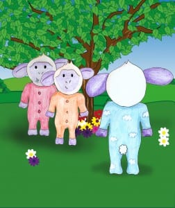
This is page 4 where Lamby approaches the other lambs in the hope to make friends. However he can’t tell the difference between their onesies and is made a fool out of by the lambs. As mentioned before i made them orange and red so that it will test a child for the difference between these colours. This is not one of my favourite pages, i feel as though the scenery is a bit too close for it to look like the sheep are under the tree, i think if i had more time i would bring the tree closer to the front so that as the viewer we feel more in the book rather than looking at it from the distance.
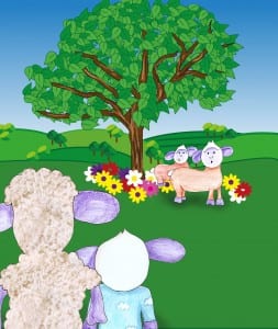
I changed the sheep because i wanted them to look the same as Lamby and Shelly. So i drew them in the distance wearing onesies. I think they look better than the first sheep i drew because it sticks with the theme of the sheep being hand drawn. It is also more obvious that they are lambs and so minus the writing i am pleased with this page and now it just needs the text to be finished. I made the lambs onesies orange and red as colour blind people can not distinguish these colours, just like they can’t with blue and purple. By only making the lambs wear the onesies, it makes it obvious that they’re the babies and therefore the colour blindness is only on them which relates to the children and highlights the fact that the book is testing for it in children.
Page 3 development
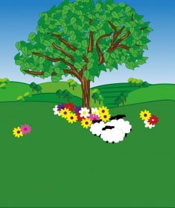
This is another draft of my third page of the book, I am unsure so far, i really like the flowers that i have added. I created these on illustrator by making them a scatter brush, just like i did with the trees, however on Photoshop i then added Lamby and Shelly. But i need to add colour to Shelly as it looks as though she hasn’t been colour in at all. Therefore i feel it still needs work, but in terms of layout, i think it works because it’s as though we’re looking into the scene.
Page 3 draft
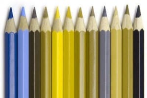
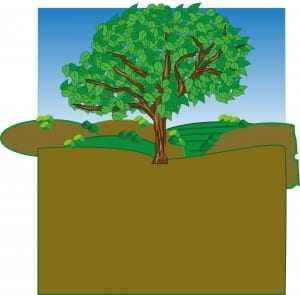
When i gathered the Colour blindess research, I found a diagram of how someone with Deuteranopia sees colours. (Image below) I then applied these colours to one of my background designs, however, i found this it’s not very appealing and wouldn’t actually test whether a child has this problem or not because the colours they would see if they were colour blind are actually the colours that they originally are, even to a person who has their full vision. So instead i am leaving all the colours normal and instead placing colours together that are difficult to distinguish between if you are colour blind.
