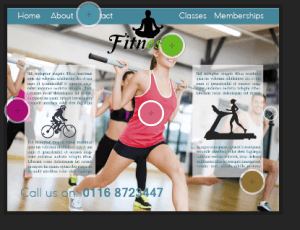
The colours for the second colour palette are more feminine colours such as two shades of pink, then the blue, green and brown. These colours are more cliche to women but don’t have the same connotations as the first colour palette does. Despite this point the layout of the colours aren’t in your face, they’re positioned in a subtle manner that works with the blue being the main accent colour.
Category: web page 2
Web Page 2
This is my second web page idea, unlike the first design, i used an actual image instead of an edited yoga pose, i feel this works better because there is no negative space. Instead of green i used blue because i felt it suited the picture better. However i feel as though the layout isn’t working, it feels more placed rather than correctly positioned. I’m also unhappy with the number at the bottom, again it just feels placed there rather than well thought out. However aside from the layout i am pleased with the idea so will continue with a similar theme but improve the general appearance of the website. The inspiration for this layout came from a photo (top image) i found on the internet as they use one main image then add their information over the top.


