Like Minded Studio

The Great Gatsby design is a main influence for my font. It was created by Two members of Like Minded Studio, Baz Lurhmann and Catherine Martin. They created the design to reflect the 1920’s and the glamour of the film. They used different sized lines in an order to create a letter. I liked the simplicity of this design and so I’ve taken inspiration from their design and put it into my font. You can see the stages of the design coming together in the three images below. The one with the white background being the first draft and the one with the gold being the finial result. I think the use of lines works really well as the art movement, art deco is all about clean lines and structure. I think i will try this effect when designing my font.

e32d228550121.560bf653b5da4bdc6958550121.560bf66670e82951a828550121.560c274b2e98c

Design 1

letters t e


12231221_10205244563298932_977208126_n

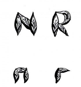
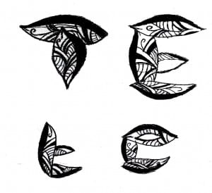
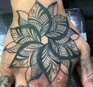
After I tried Putting text in an image, I soon realised I didn’t like the idea as it didn’t go to plan. So instead i tried putting patterns within text. (Images above) These are the examples of doing this, I used inspiration from a tattoo (image above) to come up with the shape and pattern inside, I then drew these in my sketchbook experimenting with lower case letters too. I scanned them into Photoshop and darkened them but I thought the font was messy and the shape i was using wasn’t working for all the letters. However i think the font is pretty to look at, just not neat enough to be a legit font.