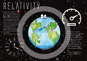
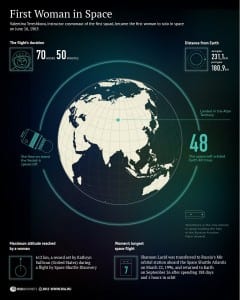
The screenshot below shows my first infographic, that I took inspiration from the poster also below. The theory involves time and speed being affected by mass and so I put two pictures on the infographic as well as planet Earth, i did this because on, Earth we have an idea of what time is whereas on another planet, time could be a completely different thing. I kept the infographic simple by making the Earth quite large and then having two columns of information each to do with speed and time which is why there is a clock and speedometer. I like this design as I feel it’s quite visually pleasing, however for a childrens infographic I feel like it needs to be brighter.
Category: Graphics
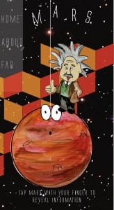
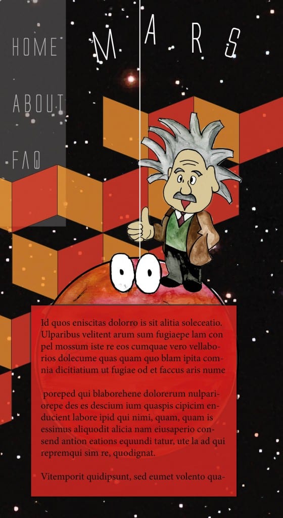
Finished Mars app design
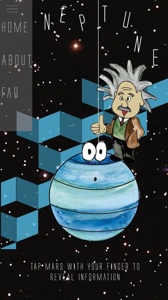
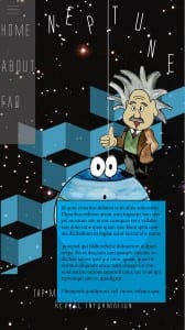
Finished Neptune app
The screenshot on the left shows the app as you would see when you’ve selected the planet from the homepage. Similar to the website version, the user would tap the planet and as shown in the screenshot on the right, a box would appear with the information. I think the finished version of the Neptune page works better than the previous drafts because the page is more colourful and attractive. The page also uses the space effectively and neatly without there looking like there’s too much negative space.
Neptune App design draft
This is the second draft of the Neptune
Page. However I feel that the writing
looks messy and too heavy for a child
to read. The page doesn’t look fun which
is key for a childrens app. The image below
show the second draft up of the page,
the text is bigger and position at the bottom to
make the page look a little less cluttered
however, I still feel like there is too much negative space though.

App design
This is my first draft of the Neptune page for the App. I put a tab bar down the side of the page as oppose to the top as most apps have a drop down menu. I then placed Neptune towards the top of the page so that I could place the writing underneath. I also placed a bar along the bottom of the app to put Einstein on and the planet, I did this to create the idea that you can press Einstein for him to read out the writing to you and you can press Neptune to take the user back to the home page. However I feel that the page layout isn’t very exciting and looks quite boring. The name of the planet isn’t displayed either which can cause confusion.
