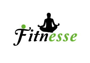
This is my finished logo idea, not much has changed other than taking out the green dot that i put above the f, i took this out because i felt that it didn’t look right. In a comical way, it resembled a figure punching the dot above the I and so i decided to take it off the F rather than the I. I reduced the size of the yoga silhouette slightly so it’s not so dominating over the font and kept to the vibrant lime green colour as i felt it worked the best our of the colours i experimented with. I feel that the final logo works well as it shows femininity through the curve of the font, the female yoga pose, a neutral healthy green colour. It also looks like a legit logo from looking at the logo research i did, it’s simple and works at a large scale or a small scale. It’s small but bold and i think it achieves the image i want the gym to have.
Category: Design
Thumb Nails
These are the thumbnails of the photos i took to create the silhouette pose. I got the idea from the artist Allison Russel and so i edited the photos to appear as silhouettes rather than photos. I did this so the attention isn’t on the person and instead focuses on the font as well therefore seeing the graphics as a logo. I think this idea works well because it makes the logo feminine and compliments the font. It also keeps it to two colours so there’s not too much going on. The second images show the original photo before and after i edited it to be a silhouette.
Logo development
Keeping with the font of the previous logo, i have changed the design slightly by making the spacing between the letters bigger and adding a yoga pose above the writing. I photographed myself doing yoga poses and then made it into a silhouette on Photoshop. I then positioned it above the writing in the middle on Indesign. However i’m not sure whether this works sitting above the writing however i definitely think that it works being added into the logo as it catches the eye and immediately makes you think it’s related to fitness.
logo idea 2
This is my second logo idea, i took inspiration from the Wii fit research as i used a similar green to them and also used black with it too. I got the font from Da Font, i chose to use it because i feel it’s quite feminine but also the way the font leans suggests speed and so i think this font is appropriate. I added the green circle on the F as i feel as though it looks like a person flexing their muscles relating to fitness. I feel the green works because it suggests health, however i wanted to avoid stereotypes of a female gym by using pink and so i feel the green works well with the font, in order for it to still look feminine. I have initially chosen black to go with the green just to break it up a bit, however i am unsure whether the black works and so it is still subject to change. 
First logo draft
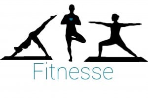
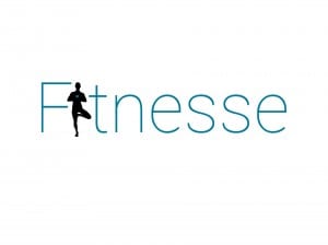
The two images below my first two drafts of logo ideas. I chose to do silhouette yoga poses because it’s more feminine and therefore might appeal to women more than it would males. I chose a powder blue almost because i felt that it’s a calming colour which suits yoga. The first logo shows the main pose which a blue heart on her chest. I did this to portray health and a love for fitness. The composition features three poses above the typography which i took inspiration from, from one of the researched logos. The second logo shows the main pose replacing the I in Fitnesse. I’m not sure which logo draft is my favourite because i feel they both have good qualities. For example the type faced logo could work on a small or big scale well whereas the other logo might not work on a small scale as it could make the writing hard to read. 


