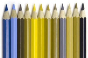
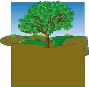
When i gathered the Colour blindess research, I found a diagram of how someone with Deuteranopia sees colours. (Image below) I then applied these colours to one of my background designs, however, i found this it’s not very appealing and wouldn’t actually test whether a child has this problem or not because the colours they would see if they were colour blind are actually the colours that they originally are, even to a person who has their full vision. So instead i am leaving all the colours normal and instead placing colours together that are difficult to distinguish between if you are colour blind.
Category: colour research
Colour research
93% of people buy a product based on the colour scheme therefore making colour the most important thing for a product. I already know what colours mean to adults from the research i did in my previous brief, however i have looked in to what appeals to children and found that Blue provides peace, water and tranquility. It is a colour that is more attractive to males than females. I have used blue and will continue using blue in my designs as i have created an outdoor scenery and so have blue skies featured in them. Green is associated with health, power and nature. Again because my theme is set outdoors there will also be a lot green featured in my designs. Purple suggests power and stimulates problem solving as well as creativity. I have used purple as the sheep are that colour, but i also want to ensure i use this because colour blind people can’t distinguish the two colours as their eyes can’t detect red light therefore purple appears blue. Orange and yellow are optimistic colours however yellow is know for making babies cry therefore i will avoid using too much yellow. This is because the colour triggers anxiety. Finally black can be overwhelming if used in large chunks so because i want my book to be a bright story, i am going to use black for small details. Finally white is a plain colour that provokes creativity as it implies a white canvas. Taking this research into consideration i will use purples, blues, pinks, oranges and obviously natural colours such as green, blue and brown. I will mainly use these because when i was young i loved the outdoors, especially seeing it animated. An example would be Shaun the Sheep. It just made me feel happy and i loved playing in fields therefore i want to reflect this in my childrens story book.
http://smallbiztrends.com/2014/06/psychology-of-colors.html This is the source link for the research.
Colour Blind research
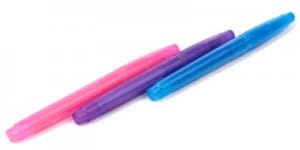
My first initial ideas are to form an educational book that tests for colour blindness in children and so i have started by researching in to colour blindness so i can understand it better, therefore i will be able to determine what colours are hard to distinguish between. I looked on the colour blindness awareness page and found that the most common form of colour blindness is know as the red/green colour blindess. This is when you can’t see red or green light therefore if you were to look at purple, you would think it’s blue because you wouldn’t be able to see the red in it which makes it purple. The image attached demonstrates this through different coloured pens.
Colour Palette
The colour palette shows that i used 5 colours, those being two different shades of blue and two different shades of green, and then white. I also used grey but that isn’t shown on the palette. These colours work together because they show health, peace and then i think the blue brings in the idea of water and fitness. It’s a cool colour suggesting that the gym that is being advertised is cool and gets you fit. I think the shades of the colours also work as they’re not too vibrant that they’d look tacky but not too dull to make the advert seem boring or unappealing.
Colour Research
Taking a theoretical approach to colour, i have been researching into using colour in advertising to gain an idea on what colours generally work better. I looked at The Psychology of colour https://www.helpscout.net/blog/psychology-of-color/ which basically stated that colour plays the most important role in advertising as 90% of people make a judgement of a product purely based on the colours. Our brains recognise a product through the use of colour therefore making the colour of a product very important.
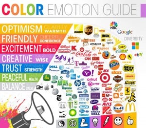
I also looked at what colours mean what, for example the table below shows that grey tones suggest balance, calmness and Neutral. Green suggests Peace, Health and growth relating to my own logo/web page design. Blue suggests trust, Dependance and Strength. Etc as shown on the image below.
