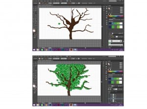
Due to a sheeps habitat mainly being in fields/countryside. I want my book to consist of lots of greens, fields, blue skies and colourful flowers. I have decided on this as it’s something that makes me feel happy, i used to love playing in fields as a kid and with lambs being my favourite animal, it felt right to make my story book revolve around this. I wanted to create as much of my scenery as i can on Illustrator so i can develop my skills in this software and so the image itself is sharper and more effective as oppose to drawing it myself and scanning it in. So the screenshot shows me having a go at drawing trees on Illustrator. I found a tutorial online that showed me how to create my own leaves and make it into a paintbrush, i found this made the process a lot easier and a lot quicker. I then found an image of a tree, used the pen tool to cut round the trunk and branches and filled it with my colour. Finally i then used my leaf brush tool i created to place leaves all over the tree. I like the design and especially the leaves so i will be using them in my final piece. However i feel the trunk needs to be bigger as i want it to stretch over the front and back cover of the book. I also want the Lamb to be featured on the front cover so it needs to be a bigger tree for the lamb to not look out of proportion. The screenshot below shows tree before and after i applied the leaves.
Category: brief 4
First character sketches
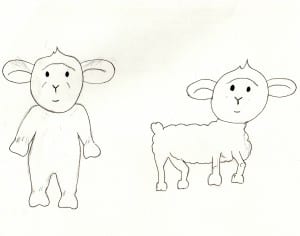
These are my first two characters for my childrens book, ‘What colour is this mummy?’ I based the lamb on a childhood teddy of mine which is why it is standing up. I tried drawing one in standing up and one standing on all fours but decided that i prefer the lamb standing up as it looks cuter and more appealing to children.
Colour Blind research
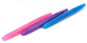
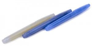
My first initial ideas are to form an educational book that tests for colour blindness in children and so i have started by researching in to colour blindness so i can understand it better, therefore i will be able to determine what colours are hard to distinguish between. I looked on the colour blindness awareness page and found that the most common form of colour blindness is know as the red/green colour blindess. This is when you can’t see red or green light therefore if you were to look at purple, you would think it’s blue because you wouldn’t be able to see the red in it which makes it purple. The image attached demonstrates this through different coloured pens.
Brief 4 research
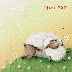
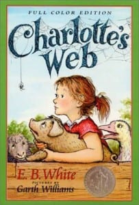
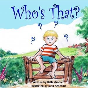
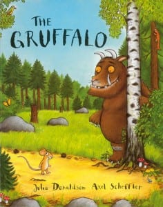
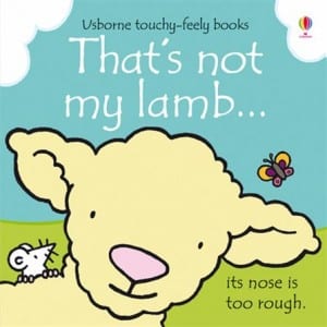
To start this project, i have taken a look at some existing children’s book covers. My first initial ideas are to base my story on a lamb, therefore i looked in to book covers featuring lambs. The covers featuring lambs are more of a simple design rather than realistic or complicated. I chose to include these in my research because my digital drawing skills aren’t so good that i could produce a realistic, complicated piece. I also looked at some other story books for ideas and inspiration and came across the Gruffalo, i really liked this design because it looks as though it has been coloured in with pencil crayon, i liked this because it reflects childrens interests and hobbies such as colouring with pencil crayons, so i feel it would attract childrens attention. I also want to make my book educational and to test for colour blindness and so it can not only show children was colours are which but also help identify colour blindness in children. The images below show the examples i selected for research.
