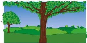
The image below shows the front cover before i took it into photoshop, so on illustrator i created the tree using vectors then added the hills, grass and the sky using the pen tool. I then put it into photoshop, cropped it down and added all the details which you can see on the finished front cover.
Category: brief 4
Book front cover
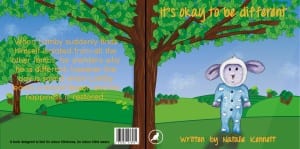
This is potentially the finished front and back cover of my childrens book. Not much has changed since the first draft, apart from i’ve changed the font and the colour of the text. From the research i know that orange is a colour that children are attracted to because it’s bright and it also provokes thought. I chose a handwritten font so the book is more child like, i think the orange works with the blue and green, it contrasts it nicely and is easily visible. However the only thing i’m still unsure on, is the trees in the background, i still feel as though the trunks are messy and could be a lot neater than they are now. Although you could argue that this works because again it creates the impression that a child has drawn them making the connection. This also ties in nicely with Lamby being coloured i by hand rather than digitally. I may come back to the front cover and tweak a few things.
Colour research
93% of people buy a product based on the colour scheme therefore making colour the most important thing for a product. I already know what colours mean to adults from the research i did in my previous brief, however i have looked in to what appeals to children and found that Blue provides peace, water and tranquility. It is a colour that is more attractive to males than females. I have used blue and will continue using blue in my designs as i have created an outdoor scenery and so have blue skies featured in them. Green is associated with health, power and nature. Again because my theme is set outdoors there will also be a lot green featured in my designs. Purple suggests power and stimulates problem solving as well as creativity. I have used purple as the sheep are that colour, but i also want to ensure i use this because colour blind people can’t distinguish the two colours as their eyes can’t detect red light therefore purple appears blue. Orange and yellow are optimistic colours however yellow is know for making babies cry therefore i will avoid using too much yellow. This is because the colour triggers anxiety. Finally black can be overwhelming if used in large chunks so because i want my book to be a bright story, i am going to use black for small details. Finally white is a plain colour that provokes creativity as it implies a white canvas. Taking this research into consideration i will use purples, blues, pinks, oranges and obviously natural colours such as green, blue and brown. I will mainly use these because when i was young i loved the outdoors, especially seeing it animated. An example would be Shaun the Sheep. It just made me feel happy and i loved playing in fields therefore i want to reflect this in my childrens story book.
http://smallbiztrends.com/2014/06/psychology-of-colors.html This is the source link for the research.
Front cover draft 1
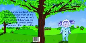
This is the first draft of my books front and back cover. I created this using both Illustrator and Photoshop. I created the hills, trees and foreground on illustrator then added tree trunks, clouds and the sun rays on photoshop. I added Lamby in also on Photoshop so i could add shadow using the burn tool to show the direction of the sun. So far i am happy with the layout, the image shows the front cover and the back cover that will be the same scene but obviously, if it were a book it would be folded in half so the scenery would stretch across both sides of the book cover. To improve this, i intend to improve the appearance of the tree trunks in the background trees and improve the fonts. The font isn’t my chosen one, it’s just to gain a perspective on the position of everything and the name of the book. Finally the colour of the font is also no my chosen one, i found that it is too dark and you can’t fully see the text. To conclude i think it’s a nice bright front cover of a book and would ironically appeal to children, considering it’s to test for colour blindness.
Second character sketches
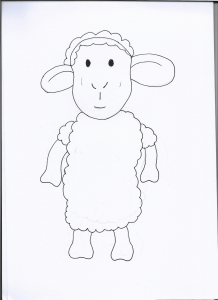
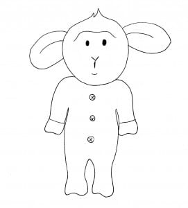
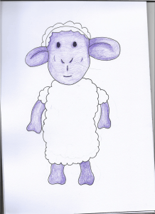
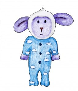
These are the sketches for Lamby and the mother. I am pleased with these and so i am working with these. I am pleased with these as the Lamb is cute which is what i wanted him to look like and the mother looks like a female sheep which is important. The second photos show them coloured in, i couldn’t decide whether to colour them myself or to colour them in on Photoshop so i experimented with both, i used pencil crayon as that’s the look i wanted them to have, so i scanned them in to photoshop and brightened them using the curve tool so they’re not as dull. However i’m still unsure as to whether this works because they look different compared to the tree i created on Illustrator.
