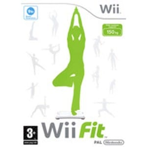
This is my second logo idea, i took inspiration from the Wii fit research as i used a similar green to them and also used black with it too. I got the font from Da Font, i chose to use it because i feel it’s quite feminine but also the way the font leans suggests speed and so i think this font is appropriate. I added the green circle on the F as i feel as though it looks like a person flexing their muscles relating to fitness. I feel the green works because it suggests health, however i wanted to avoid stereotypes of a female gym by using pink and so i feel the green works well with the font, in order for it to still look feminine. I have initially chosen black to go with the green just to break it up a bit, however i am unsure whether the black works and so it is still subject to change. 
Category: brief 3
First logo draft
The two images below my first two drafts of logo ideas. I chose to do silhouette yoga poses because it’s more feminine and therefore might appeal to women more than it would males. I chose a powder blue almost because i felt that it’s a calming colour which suits yoga. The first logo shows the main pose which a blue heart on her chest. I did this to portray health and a love for fitness. The composition features three poses above the typography which i took inspiration from, from one of the researched logos. The second logo shows the main pose replacing the I in Fitnesse. I’m not sure which logo draft is my favourite because i feel they both have good qualities. For example the type faced logo could work on a small or big scale well whereas the other logo might not work on a small scale as it could make the writing hard to read. 
Wii fit research
Research
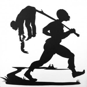
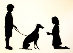
I looked into an artist who works by photographing silhouettes. I did this to see how she captures a story almost, by just using an outline of a figure. I found this artists work quirky and entertaining almost as her work shows a moment captured as a silhouette and so i have used this as inspiration for my own logo.
Logo research
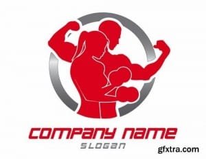
Before designing a brochure or website, i have started by designing a logo first and so i have researched some existing logos to gain a perspective on the compositions, colours and graphics. I had the idea of using silhouettes so looked at some logos that also use silhouettes. The red logo template shows a male and a female in the same composition showing that fitness is for men and women. The two colours red and silver are used which suggests power and iron. They’re not relaxing colours and so imply that the gym is about working hard to achieve goals. The second logo i looked at was Pure gym. They use blue and green and have a simple type faced logo. This logo suggests a friendly environment that you can join and work at your own pace as stated by their slogan ‘enjoy fitness’. Another logo i looked at goes back to the silhouette idea and uses red and black. Along the top are silhouettes of people working out showing a variety of fitness routines, therefore suggesting that there’s a variety of workouts that you can do at the gym.
