Colour Research

Taking a theoretical approach to colour, i have been researching into using colour in advertising to gain an idea on what colours generally work better. I looked at The Psychology of colour https://www.helpscout.net/blog/psychology-of-color/ which basically stated that colour plays the most important role in advertising as 90% of people make a judgement of a product purely based on the colours. Our brains recognise a product through the use of colour therefore making the colour of  a product very important.

I also looked at what colours mean what, for example the table below shows that grey tones suggest balance, calmness and Neutral. Green suggests Peace, Health and growth relating to my own logo/web page design. Blue suggests trust, Dependance and Strength. Etc as shown on the image below.
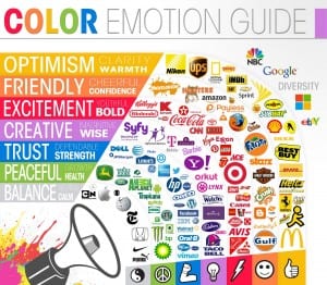
color-emotion

Experimenting with colours

These four logos show the experimentation of different colours, I originally chose a green but then changed to using a blue and a peach to experiment with more pastel colours as they feel more feminine. However i have decided that i prefer the green because it not only suggests health but it’s a vibrant colour. I also tried a more enhanced orange/peach colour to see if that would make a difference which is a good potential for the final logo colour. The peach i chose works because it resembles a skin tone which ties in with the yoga pose above the font. Finally I experimented with a pink, but i soon decided that this did not work because it is too stereotypical for a female gym.


logo different colour logo with pink logo with peach logo different colour green logo different colour bluer logo different colour blue

Thumb Nails

These are the thumbnails of the photos i took to create the silhouette pose. I got the idea from the artist Allison Russel and so i edited the photos to appear as silhouettes rather than photos. I did this so the attention isn’t on the person and instead focuses on the font as well therefore seeing the graphics as a logo. I think this idea works well because it makes the logo feminine and compliments the font. It also keeps it to two colours so there’s not too much going on.  The second images show the original photo before and after i edited it to be a silhouette.

screen shot thumb nail post

Logo development

Keeping with the font of the previous logo, i have changed the design slightly by making the spacing between the letters bigger and adding a yoga pose above the writing. I photographed myself doing yoga poses and then made it into a silhouette on Photoshop. I then positioned it above the writing in the middle on Indesign. However i’m not sure whether this works sitting above the writing however i definitely think that it works being added into the logo as it catches the eye and immediately makes you think it’s related to fitness.

Untitled-4