Final website front page

front page

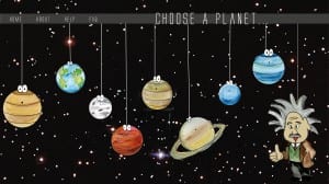
This is the final website front page that I produced, the layout is a lot different to the first one. After playing around with some layouts as a group we decided that this layout works best as the planets are also in the correct order as they appear are on the solar system therefore the idea is not only educating children on Einsteins relativity but also like the other website layout, the user chooses a planet with their mouse which takes them to another page telling them about the theory.. We also made the page look more like a website by putting a tab bar at the top with the option to get to the homepage. Finally the font is different on this layout, we chose more of a neat font to go with the space theme. I think this new font and layout looks a lot neater and more professional as oppose to the other one, the whole layout looks neater also and spaced out therefore cancelling out any negative space.
 

Website page layout idea


website idea

This was the first finished front page idea using the new graphics that we made ourselves. The planets are strung up from the top, which is inspired from the little big planet research. The idea behind this website page is that the user selects a planet using their mouse which then takes them to a new page depending on what planet they choose. The title at the top is suppose to look as though it has been handwritten on a piece of paper which has then been ripped off and placed on the website by Einstein as the font is the closest one I could find to Einsteins writing.

Second Graphics

The image below shows similar graphics to the first ones however this time I drew them and painted them and scanned them into Photoshop and then just enhanced the colours. I think these graphics work better because we want our media products to look as though children have drawn the graphics themselves, therefore I feel that these graphics show this. However I feel that Jupiter and Venus look too similar with their colours, so I feel like that needs to be changed so their distinctive. Untitled-2

Infographic research

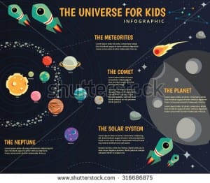
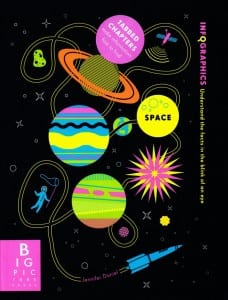
Finally I researched into existing infographics and again mainly looked into space themed ones. I basically just looked at some from the internet to see what they’re all about.  So far i’ve seen that they contain more information than imagery however there is a good balance between the two. The screenshots below show the examples I have looked at, so far my ideas aim towards making it have a fun layout and some form of direction so that the viewer knows where to look first and where to look next.stock-vector-the-universe-kids-infographics-solar-system-planets-comparison-sun-and-moon-galaxies-316686875 Infographics---Space_800_1049_c1