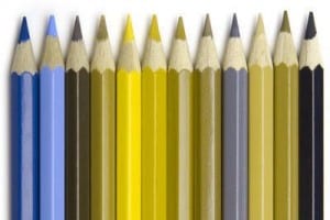
When i gathered the Colour blindess research, I found a diagram of how someone with Deuteranopia sees colours. (Image below) I then applied these colours to one of my background designs, however, i found this it’s not very appealing and wouldn’t actually test whether a child has this problem or not because the colours they would see if they were colour blind are actually the colours that they originally are, even to a person who has their full vision. So instead i am leaving all the colours normal and instead placing colours together that are difficult to distinguish between if you are colour blind.
Category: Book cover draft
process of book cover
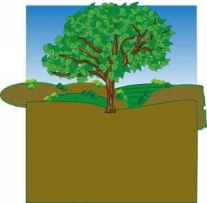
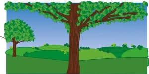
The image below shows the front cover before i took it into photoshop, so on illustrator i created the tree using vectors then added the hills, grass and the sky using the pen tool. I then put it into photoshop, cropped it down and added all the details which you can see on the finished front cover.
Book front cover
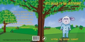
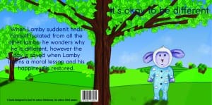
This is potentially the finished front and back cover of my childrens book. Not much has changed since the first draft, apart from i’ve changed the font and the colour of the text. From the research i know that orange is a colour that children are attracted to because it’s bright and it also provokes thought. I chose a handwritten font so the book is more child like, i think the orange works with the blue and green, it contrasts it nicely and is easily visible. However the only thing i’m still unsure on, is the trees in the background, i still feel as though the trunks are messy and could be a lot neater than they are now. Although you could argue that this works because again it creates the impression that a child has drawn them making the connection. This also ties in nicely with Lamby being coloured i by hand rather than digitally. I may come back to the front cover and tweak a few things.
Front cover draft 1
This is the first draft of my books front and back cover. I created this using both Illustrator and Photoshop. I created the hills, trees and foreground on illustrator then added tree trunks, clouds and the sun rays on photoshop. I added Lamby in also on Photoshop so i could add shadow using the burn tool to show the direction of the sun. So far i am happy with the layout, the image shows the front cover and the back cover that will be the same scene but obviously, if it were a book it would be folded in half so the scenery would stretch across both sides of the book cover. To improve this, i intend to improve the appearance of the tree trunks in the background trees and improve the fonts. The font isn’t my chosen one, it’s just to gain a perspective on the position of everything and the name of the book. Finally the colour of the font is also no my chosen one, i found that it is too dark and you can’t fully see the text. To conclude i think it’s a nice bright front cover of a book and would ironically appeal to children, considering it’s to test for colour blindness.
