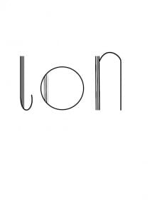
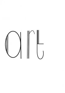
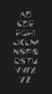
These are my six lower case fonts which I dislike. I found doing capitals a lot easier than doing lower case, therefore my upper case letters are my favorite. Some of the letters are thinner than others so if I get some spare time I’ll neaten them up to make them look better.
Category: Art deco
Favourite letters
Like Minded Studio
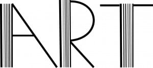
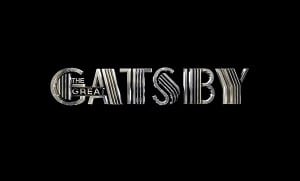
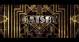
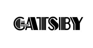
The Great Gatsby design is a main influence for my font. It was created by Two members of Like Minded Studio, Baz Lurhmann and Catherine Martin. They created the design to reflect the 1920’s and the glamour of the film. They used different sized lines in an order to create a letter. I liked the simplicity of this design and so I’ve taken inspiration from their design and put it into my font. You can see the stages of the design coming together in the three images below. The one with the white background being the first draft and the one with the gold being the finial result. I think the use of lines works really well as the art movement, art deco is all about clean lines and structure. I think i will try this effect when designing my font.
Research into Art Deco
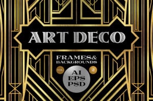
I was doing some research into fonts and came across art deco. I Liked the simplicity of the font so kept going with idea as it’s an art movement that i’ve always admired. I did some research into art deco and the images below are the ones i picked out because it shows the colour scheme that I would like the work with and the style of font.
