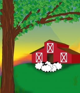
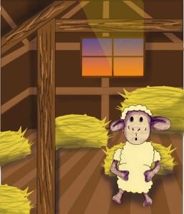
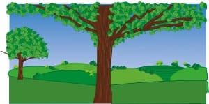
This is my second page of my childrens book, however i have changed it to replace the first. This is because it’s a new design and i was originally going to show Lamby being born. But instead i chose to imply it instead as it is a children’s book, So i have changed it to being a barn on the hill then the next shot will be Shelly before another page being them in the field. The process of this page is the same as the other, I formed the tree and hill and some of the barn on the Illustrator then i moved it into Photoshop where i added the details on the barn, i added the sky, grass, light and the sheep.
 Author: Natalie Kennett
first page
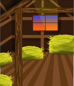
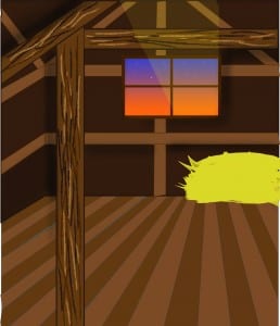
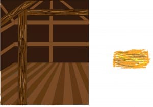
This is the first page of the childrens book i have created so far, the idea is that Shelly the sheep has gone into labour with the lamb that is featured on the front cover. Therefore i have drawn her in barn lit by the morning sun, surrounded by hay. Like before i drew the scenery on illustrator then moved it into photoshop which is where i added the window, the sunlight, the shadows, the hay and finally Shelly. This took me a while to get right as i had trouble drawing the hay, i couldn’t get it to look like hay without looking too messy. However in the end i managed to find a brush that gave the jaggered edges and then used different shades of yellow to faintly add the shading and the straw effect. The screenshot with the hay next to the barn is the first attempt at drawing some hay, you can see why i hated this as it looks messy. After the straw i added the sheep sitting up against a bale of hay holding on the her tummy implying that she is in labour. Because of it being my drawing that i scanned in, it was very white and so i added an orange filter to give her warmth and then duplicated the layer, before choosing a blend mode which made her blend in with the scene more. The first three images before i added the lamb look more vibrant as they weren’t exported as RGB, however the screenshot with the sheep was and so they are the original colours.
process of book cover
The image below shows the front cover before i took it into photoshop, so on illustrator i created the tree using vectors then added the hills, grass and the sky using the pen tool. I then put it into photoshop, cropped it down and added all the details which you can see on the finished front cover.
Book front cover
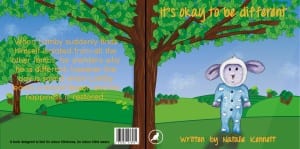
This is potentially the finished front and back cover of my childrens book. Not much has changed since the first draft, apart from i’ve changed the font and the colour of the text. From the research i know that orange is a colour that children are attracted to because it’s bright and it also provokes thought. I chose a handwritten font so the book is more child like, i think the orange works with the blue and green, it contrasts it nicely and is easily visible. However the only thing i’m still unsure on, is the trees in the background, i still feel as though the trunks are messy and could be a lot neater than they are now. Although you could argue that this works because again it creates the impression that a child has drawn them making the connection. This also ties in nicely with Lamby being coloured i by hand rather than digitally. I may come back to the front cover and tweak a few things.
Colour research
93% of people buy a product based on the colour scheme therefore making colour the most important thing for a product. I already know what colours mean to adults from the research i did in my previous brief, however i have looked in to what appeals to children and found that Blue provides peace, water and tranquility. It is a colour that is more attractive to males than females. I have used blue and will continue using blue in my designs as i have created an outdoor scenery and so have blue skies featured in them. Green is associated with health, power and nature. Again because my theme is set outdoors there will also be a lot green featured in my designs. Purple suggests power and stimulates problem solving as well as creativity. I have used purple as the sheep are that colour, but i also want to ensure i use this because colour blind people can’t distinguish the two colours as their eyes can’t detect red light therefore purple appears blue. Orange and yellow are optimistic colours however yellow is know for making babies cry therefore i will avoid using too much yellow. This is because the colour triggers anxiety. Finally black can be overwhelming if used in large chunks so because i want my book to be a bright story, i am going to use black for small details. Finally white is a plain colour that provokes creativity as it implies a white canvas. Taking this research into consideration i will use purples, blues, pinks, oranges and obviously natural colours such as green, blue and brown. I will mainly use these because when i was young i loved the outdoors, especially seeing it animated. An example would be Shaun the Sheep. It just made me feel happy and i loved playing in fields therefore i want to reflect this in my childrens story book.
http://smallbiztrends.com/2014/06/psychology-of-colors.html This is the source link for the research.
