The image below shows similar graphics to the first ones however this time I drew them and painted them and scanned them into Photoshop and then just enhanced the colours. I think these graphics work better because we want our media products to look as though children have drawn the graphics themselves, therefore I feel that these graphics show this. However I feel that Jupiter and Venus look too similar with their colours, so I feel like that needs to be changed so their distinctive. 
 Author: Natalie Kennett
Infographic research
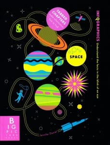
Finally I researched into existing infographics and again mainly looked into space themed ones. I basically just looked at some from the internet to see what they’re all about. So far i’ve seen that they contain more information than imagery however there is a good balance between the two. The screenshots below show the examples I have looked at, so far my ideas aim towards making it have a fun layout and some form of direction so that the viewer knows where to look first and where to look next.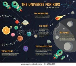
App Research
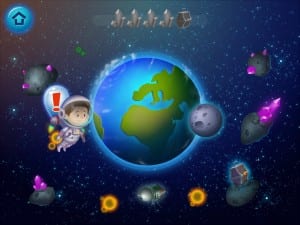
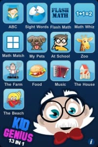
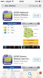
Next we looked into App designs and how websites adapt their product to suit different technologies. From this I also took ideas for layouts. The screenshots below show the examples I looked at. The one on the far left shows a quiz app that allows you to select a tile on the app and so we will use this in our app idea. It will work as the user will select a planet layed out in a rows. The middle screenshot shows an app on an Ipad in which the user can move around to explore space. Finally the screenshot on the right shows the app version of BBC bitesize. It has been adapted so that you have all the option along the bottom to take you back to the homepage.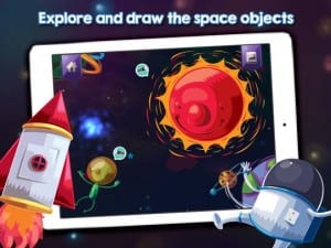
 een.
een.
research
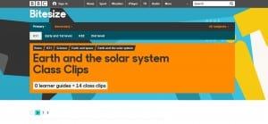
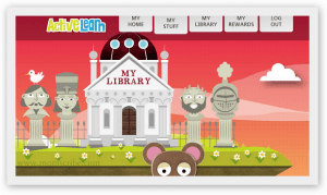
Within my group we decided that we wanted to aim our project towards young children therefore we have decided to make it an educational product. To start with I researched into websites such as BBC bitesize and looked at various screenshots of other existing websites. From looking at these, I can see that they’re mostly imagery rather than text so I think that as a group we will keep text to a minimum and make it more visual and bright. The websites are also simple rather than complex and so we will ensure that ours are too simple. The screenshots below show the examples I have looked at. I specifically looked at space themed websites to gain some inspiration for graphics. 