The colour palette shows that i used 5 colours, those being two different shades of blue and two different shades of green, and then white. I also used grey but that isn’t shown on the palette. These colours work together because they show health, peace and then i think the blue brings in the idea of water and fitness. It’s a cool colour suggesting that the gym that is being advertised is cool and gets you fit. I think the shades of the colours also work as they’re not too vibrant that they’d look tacky but not too dull to make the advert seem boring or unappealing.
Month: March 2016
First web page draft
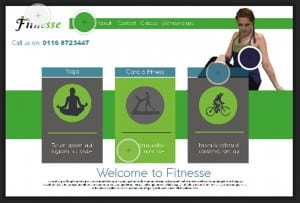
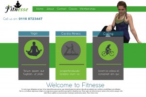
This is my first draft of a webpage, I wanted to use yoga poses as it’s a feminine workout and is all about connecting with the earth and feeling relaxed so to give this vibe, i used green and grey to suggest peace, earth and health. I cartooned the yoga pose on Photoshop to make it tie in the Wii fit research, however i feel this doesn’t work as well because it still looks realistic and grainy. The way i have positioned it doesn’t make it obvious that it’s a yoga pose, it just looks as the person is sat there. The positives of this layout are: the colours work well together and the layout is effective through the use of boxes and animations of each activity. The negatives are that the website seems boring and not modern almost, there is a large amount of negative space that could be filled either through the use of colour or by adding something else. Finally the logo featured is the old one and is also just placed in the corner, i feel like it could be placed somewhere better to make it more creative and interesting to look at.
Website research
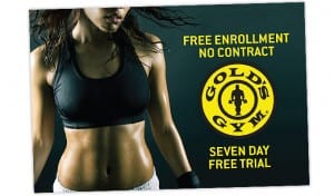
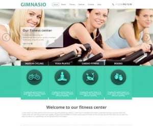
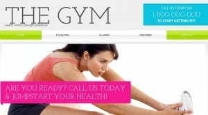
I have decided to create a web page for my female gym and so started off by looking at existing examples. The images below show some gym websites that i took off the internet for inspiration in terms of layout and colour. The websites i looked at use images as a main part of their website, for example usually people working out or posing in gym clothes. The text is incorporated through boxes and the use of a tab bar along the top followed by the logo. The colours that are used are bright tones of blue, pink, green and white showing health and giving the theme a positive bright outlook. From looking at the colour research i now know that these colours are used to advertise the gym in a positive way and so i will incorporate this idea into my designs. I also came across some designs that use black and gold instead of white, green and blue. These show more power through not only the use of colours but also the images used. For example the image below advertising Golds Gym display a healthy womans toned abs portraying her as a super fit and healthy, powerful woman. The model is also sweaty therefore showing this idea of power and strength, which is the impression we get through the use of the gold and black.
Colour Research
Taking a theoretical approach to colour, i have been researching into using colour in advertising to gain an idea on what colours generally work better. I looked at The Psychology of colour https://www.helpscout.net/blog/psychology-of-color/ which basically stated that colour plays the most important role in advertising as 90% of people make a judgement of a product purely based on the colours. Our brains recognise a product through the use of colour therefore making the colour of a product very important.
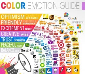
I also looked at what colours mean what, for example the table below shows that grey tones suggest balance, calmness and Neutral. Green suggests Peace, Health and growth relating to my own logo/web page design. Blue suggests trust, Dependance and Strength. Etc as shown on the image below.
Finished logo
This is my finished logo idea, not much has changed other than taking out the green dot that i put above the f, i took this out because i felt that it didn’t look right. In a comical way, it resembled a figure punching the dot above the I and so i decided to take it off the F rather than the I. I reduced the size of the yoga silhouette slightly so it’s not so dominating over the font and kept to the vibrant lime green colour as i felt it worked the best our of the colours i experimented with. I feel that the final logo works well as it shows femininity through the curve of the font, the female yoga pose, a neutral healthy green colour. It also looks like a legit logo from looking at the logo research i did, it’s simple and works at a large scale or a small scale. It’s small but bold and i think it achieves the image i want the gym to have.

