This is the third colour palette which features pink, skin tone, two greens and a blue is a more feminine palette in comparison to the others, however it is not my favourite because i don’t think the colours work nicely on a palette. Although despite this, i like how the peach works with the pink and greens. 
Month: March 2016
Web Page 3
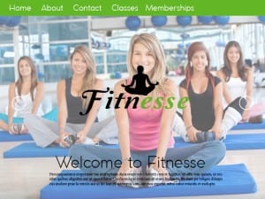
This is my third website page idea, I kept a similar layout to the previous one but made the main image slightly transparent so that it didn’t stand out as much. By doing this it draws more attention to the main logo in the, i also moved the position of the logo so that it’s in the middle of the page, therefore the most eye catching object on the web page. I made the banner at the top green because i feel that it’s a more positive bright colour, it also stands out from the photo wheres as the blue didn’t as much. I left the page to a bare minimal to create the impression that the two arrows at the side move you to another page, named at the top on the banner. I then added a welcome to fitnesse at the bottom with some placeholder text to show that, that is where the information you need is.
Web page 2 colour palette
The colours for the second colour palette are more feminine colours such as two shades of pink, then the blue, green and brown. These colours are more cliche to women but don’t have the same connotations as the first colour palette does. Despite this point the layout of the colours aren’t in your face, they’re positioned in a subtle manner that works with the blue being the main accent colour.
Web Page 2
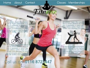
This is my second web page idea, unlike the first design, i used an actual image instead of an edited yoga pose, i feel this works better because there is no negative space. Instead of green i used blue because i felt it suited the picture better. However i feel as though the layout isn’t working, it feels more placed rather than correctly positioned. I’m also unhappy with the number at the bottom, again it just feels placed there rather than well thought out. However aside from the layout i am pleased with the idea so will continue with a similar theme but improve the general appearance of the website. The inspiration for this layout came from a photo (top image) i found on the internet as they use one main image then add their information over the top.
Juxtaposition
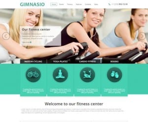
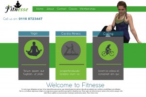
I built my first web page based on an example that i found on the internet. I mirrored the layout because i felt that it works as a simple gym web page. I liked how they used small images to show what the gym has to offer. So i used this idea and put in a yoga pose, a woman on a treadmill and a cyclist to show that the gym offers cardio as well as toning exercises. I changed certain things such as instead of using a photo in the top centre, i used my own figure, however i feel that it works better as a photo as it reduces negative space. Everything else i built on mine was based on the internet image.
