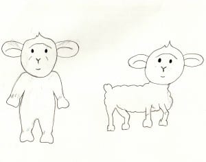
These are my first two characters for my childrens book, ‘What colour is this mummy?’ I based the lamb on a childhood teddy of mine which is why it is standing up. I tried drawing one in standing up and one standing on all fours but decided that i prefer the lamb standing up as it looks cuter and more appealing to children.
Month: March 2016
Colour Blind research
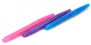
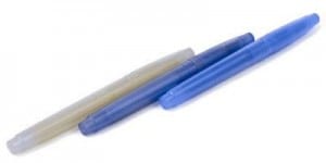
My first initial ideas are to form an educational book that tests for colour blindness in children and so i have started by researching in to colour blindness so i can understand it better, therefore i will be able to determine what colours are hard to distinguish between. I looked on the colour blindness awareness page and found that the most common form of colour blindness is know as the red/green colour blindess. This is when you can’t see red or green light therefore if you were to look at purple, you would think it’s blue because you wouldn’t be able to see the red in it which makes it purple. The image attached demonstrates this through different coloured pens.
Brief 4 research
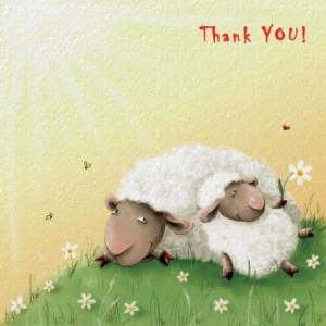
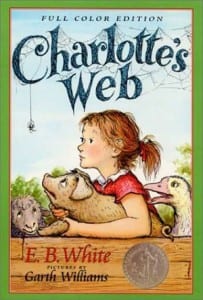
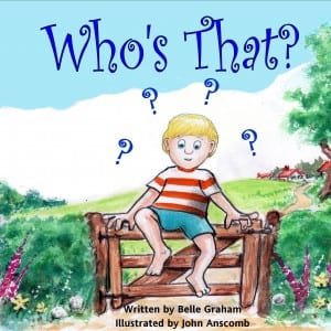
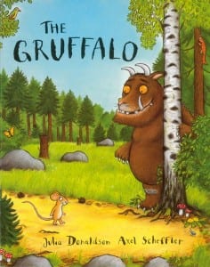
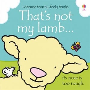
To start this project, i have taken a look at some existing children’s book covers. My first initial ideas are to base my story on a lamb, therefore i looked in to book covers featuring lambs. The covers featuring lambs are more of a simple design rather than realistic or complicated. I chose to include these in my research because my digital drawing skills aren’t so good that i could produce a realistic, complicated piece. I also looked at some other story books for ideas and inspiration and came across the Gruffalo, i really liked this design because it looks as though it has been coloured in with pencil crayon, i liked this because it reflects childrens interests and hobbies such as colouring with pencil crayons, so i feel it would attract childrens attention. I also want to make my book educational and to test for colour blindness and so it can not only show children was colours are which but also help identify colour blindness in children. The images below show the examples i selected for research.
Final designs
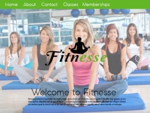
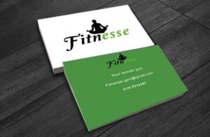
These are my final products, so the web page, logo, colour palette and a mock up of the business card. Overall i am pleased with my final design as i feel they reflect femininity, show good, effective use of colour and look legit. My favourite part to this project would be the logo, I feel this is the best aspect to this project and works well to achieve the image i want my gym to have. If i was to do this again i would spend more time making the website more unique and would capture my own images. I would also research in to some design skills that i could apply to make the logo work better, for example experiment more with vectors. I’m pleased with the colours as i think they compliment each other but also achieving the feel of health and strength without being too harsh or too cliche for females.
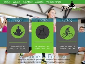
Web page 4
This is another mock up i tried, I incorporated the first design with the third and added the boxes in with and image behind to see what it would look like. I think this works well however i feel the colours would look better if they were more blue to suit the background image. Though seeing this layout made me rethink and actually i prefer the third web page design out of the 4 i mocked up.
