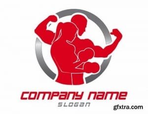
Before designing a brochure or website, i have started by designing a logo first and so i have researched some existing logos to gain a perspective on the compositions, colours and graphics. I had the idea of using silhouettes so looked at some logos that also use silhouettes. The red logo template shows a male and a female in the same composition showing that fitness is for men and women. The two colours red and silver are used which suggests power and iron. They’re not relaxing colours and so imply that the gym is about working hard to achieve goals. The second logo i looked at was Pure gym. They use blue and green and have a simple type faced logo. This logo suggests a friendly environment that you can join and work at your own pace as stated by their slogan ‘enjoy fitness’. Another logo i looked at goes back to the silhouette idea and uses red and black. Along the top are silhouettes of people working out showing a variety of fitness routines, therefore suggesting that there’s a variety of workouts that you can do at the gym.
Month: February 2016
Brief 3 research
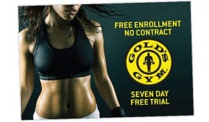
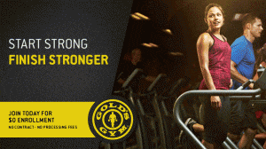
I have chosen fitnesse to respond to and so i have started off by researching existing gym brochures. The images below show some of the images i collected. They show power through the use of colour and the wording suggests that joining a gym is about building strength and becoming fit and so healthy, toned models are used on the brochures to portray this. I have started with looking at uni sex gyms just to get a broad understanding of the colours and composition that are generally used.


