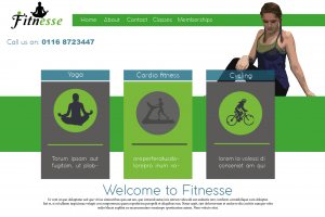
This is my first draft of a webpage, I wanted to use yoga poses as it’s a feminine workout and is all about connecting with the earth and feeling relaxed so to give this vibe, i used green and grey to suggest peace, earth and health. I cartooned the yoga pose on Photoshop to make it tie in the Wii fit research, however i feel this doesn’t work as well because it still looks realistic and grainy. The way i have positioned it doesn’t make it obvious that it’s a yoga pose, it just looks as the person is sat there. The positives of this layout are: the colours work well together and the layout is effective through the use of boxes and animations of each activity. The negatives are that the website seems boring and not modern almost, there is a large amount of negative space that could be filled either through the use of colour or by adding something else. Finally the logo featured is the old one and is also just placed in the corner, i feel like it could be placed somewhere better to make it more creative and interesting to look at.
