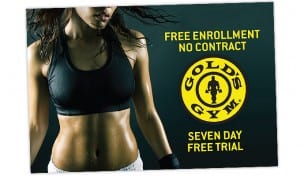
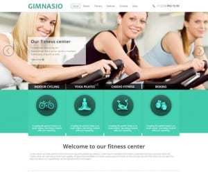
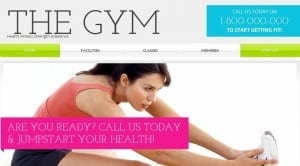
I have decided to create a web page for my female gym and so started off by looking at existing examples. The images below show some gym websites that i took off the internet for inspiration in terms of layout and colour. The websites i looked at use images as a main part of their website, for example usually people working out or posing in gym clothes. The text is incorporated through boxes and the use of a tab bar along the top followed by the logo. The colours that are used are bright tones of blue, pink, green and white showing health and giving the theme a positive bright outlook. From looking at the colour research i now know that these colours are used to advertise the gym in a positive way and so i will incorporate this idea into my designs. I also came across some designs that use black and gold instead of white, green and blue. These show more power through not only the use of colours but also the images used. For example the image below advertising Golds Gym display a healthy womans toned abs portraying her as a super fit and healthy, powerful woman. The model is also sweaty therefore showing this idea of power and strength, which is the impression we get through the use of the gold and black.


