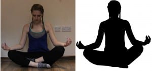
These are the thumbnails of the photos i took to create the silhouette pose. I got the idea from the artist Allison Russel and so i edited the photos to appear as silhouettes rather than photos. I did this so the attention isn’t on the person and instead focuses on the font as well therefore seeing the graphics as a logo. I think this idea works well because it makes the logo feminine and compliments the font. It also keeps it to two colours so there’s not too much going on. The second images show the original photo before and after i edited it to be a silhouette.

