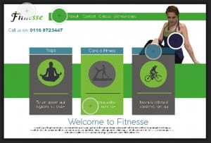
The colour palette shows that i used 5 colours, those being two different shades of blue and two different shades of green, and then white. I also used grey but that isn’t shown on the palette. These colours work together because they show health, peace and then i think the blue brings in the idea of water and fitness. It’s a cool colour suggesting that the gym that is being advertised is cool and gets you fit. I think the shades of the colours also work as they’re not too vibrant that they’d look tacky but not too dull to make the advert seem boring or unappealing.

