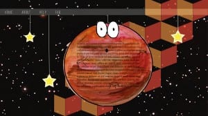
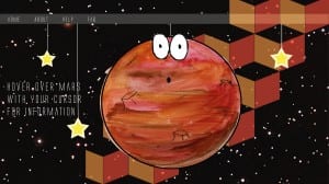
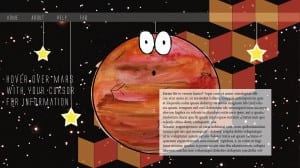
The three screenshots below show one of 6 pages from the website that me and my group produced. I started out by placing the tab bar at the top of the page to maintain a body on each page for the website. To make the background more interesting as to add more colour I made a pattern in Illustrator and used red and orange to match the colour of Mars and then turned down the opacity so it wasn’t too intense. I then placed mars central of the screen and strung him up again to again maintain the theme. The screenshots show the development of the text on Mars. I started out by placing it on the centre of Mars, however as group we thought that it was hard to read and so I decided to make it so that a box appears if you hover the cursor over the planet. I found that this makes the layout more interesting as well as interactive for the user. I made it so a white box appears which is big enough to read but is only there when you want to read the information therefore it does not always cover the main imagery of the page.


