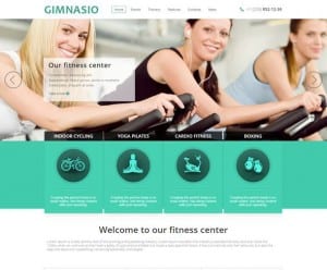
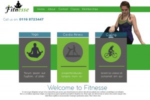
I built my first web page based on an example that i found on the internet. I mirrored the layout because i felt that it works as a simple gym web page. I liked how they used small images to show what the gym has to offer. So i used this idea and put in a yoga pose, a woman on a treadmill and a cyclist to show that the gym offers cardio as well as toning exercises. I changed certain things such as instead of using a photo in the top centre, i used my own figure, however i feel that it works better as a photo as it reduces negative space. Everything else i built on mine was based on the internet image.

