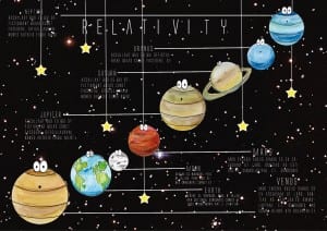
This is my second infographic idea and my last one, I am pleased with this one as i think it’s busy enough to be interesting to a child but it’s also not too much either. I am pleased with the layout of this one which I took inspiration from one of the posters i looked into at the beginning of the brief. I chose to line the planets up diagonally do they stretched across the page and i could draw information off of them. The stars were featured on the website but not the app and so I put them on the poster just to add more to it as I chose not to add the squares. I did this so that the poster looked different but still reflected the similar style. I feel that i have made use of any negative space, particularly with the stars. These infographics are my versions of ideas whereas our real one is featured on the blog above.
