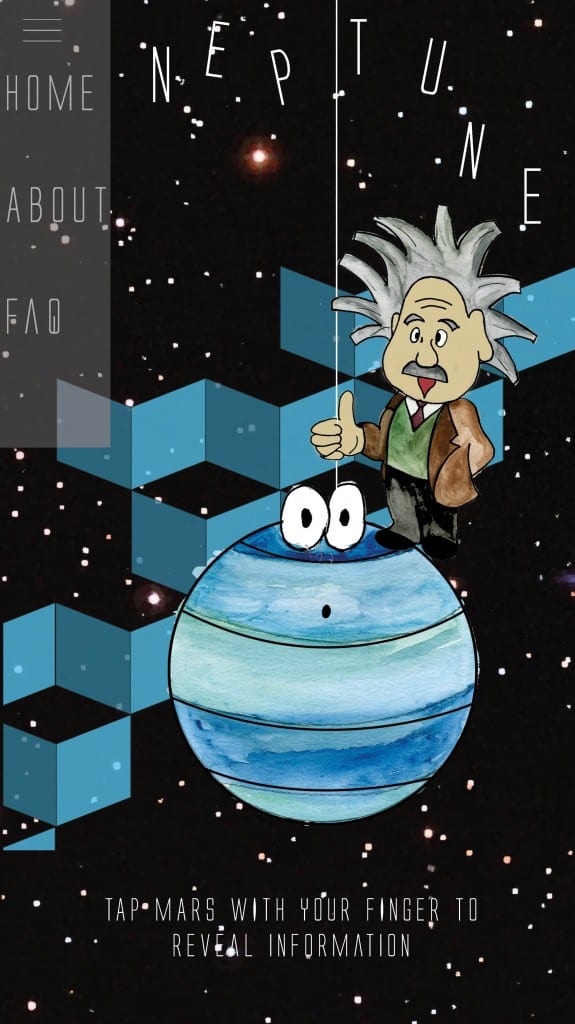
The screenshot on the left shows the app as you would see when you’ve selected the planet from the homepage. Similar to the website version, the user would tap the planet and as shown in the screenshot on the right, a box would appear with the information. I think the finished version of the Neptune page works better than the previous drafts because the page is more colourful and attractive. The page also uses the space effectively and neatly without there looking like there’s too much negative space.

