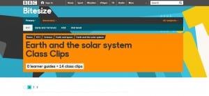
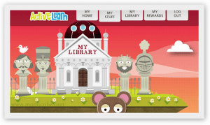
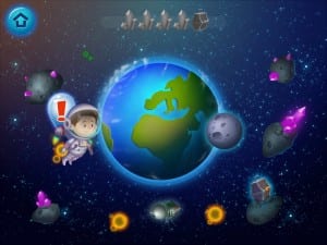
Within my group we decided that we wanted to aim our project towards young children therefore we have decided to make it an educational product. To start with I researched into websites such as BBC bitesize and looked at various screenshots of other existing websites. From looking at these, I can see that they’re mostly imagery rather than text so I think that as a group we will keep text to a minimum and make it more visual and bright. The websites are also simple rather than complex and so we will ensure that ours are too simple. The screenshots below show the examples I have looked at. I specifically looked at space themed websites to gain some inspiration for graphics. 

