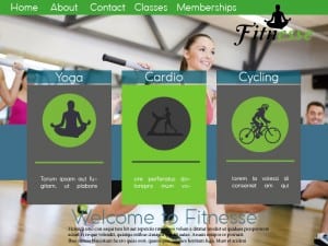
This is another mock up i tried, I incorporated the first design with the third and added the boxes in with and image behind to see what it would look like. I think this works well however i feel the colours would look better if they were more blue to suit the background image. Though seeing this layout made me rethink and actually i prefer the third web page design out of the 4 i mocked up.
