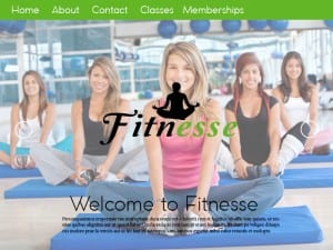
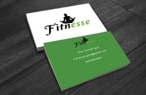
These are my final products, so the web page, logo, colour palette and a mock up of the business card. Overall i am pleased with my final design as i feel they reflect femininity, show good, effective use of colour and look legit. My favourite part to this project would be the logo, I feel this is the best aspect to this project and works well to achieve the image i want my gym to have. If i was to do this again i would spend more time making the website more unique and would capture my own images. I would also research in to some design skills that i could apply to make the logo work better, for example experiment more with vectors. I’m pleased with the colours as i think they compliment each other but also achieving the feel of health and strength without being too harsh or too cliche for females.


