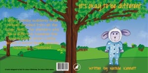
This is potentially the finished front and back cover of my childrens book. Not much has changed since the first draft, apart from i’ve changed the font and the colour of the text. From the research i know that orange is a colour that children are attracted to because it’s bright and it also provokes thought. I chose a handwritten font so the book is more child like, i think the orange works with the blue and green, it contrasts it nicely and is easily visible. However the only thing i’m still unsure on, is the trees in the background, i still feel as though the trunks are messy and could be a lot neater than they are now. Although you could argue that this works because again it creates the impression that a child has drawn them making the connection. This also ties in nicely with Lamby being coloured i by hand rather than digitally. I may come back to the front cover and tweak a few things.
