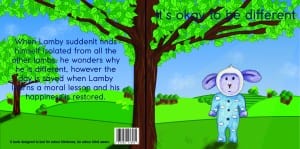
This is the first draft of my books front and back cover. I created this using both Illustrator and Photoshop. I created the hills, trees and foreground on illustrator then added tree trunks, clouds and the sun rays on photoshop. I added Lamby in also on Photoshop so i could add shadow using the burn tool to show the direction of the sun. So far i am happy with the layout, the image shows the front cover and the back cover that will be the same scene but obviously, if it were a book it would be folded in half so the scenery would stretch across both sides of the book cover. To improve this, i intend to improve the appearance of the tree trunks in the background trees and improve the fonts. The font isn’t my chosen one, it’s just to gain a perspective on the position of everything and the name of the book. Finally the colour of the font is also no my chosen one, i found that it is too dark and you can’t fully see the text. To conclude i think it’s a nice bright front cover of a book and would ironically appeal to children, considering it’s to test for colour blindness.
