The identity brief was something that challenged me, but in the end I really enjoyed it. I found that the colour scheme was really easy because from the research I did, I found that the general colours that represented health were green and blue. Therefore I used these as my main colours, I also used subtle pink which I felt worked really nicely too. If I was to do this brief again I would definitely try and take my own fitness photos in a proper workout space, just so that all of the material was mine. The aspects of the project that I liked were my logo and the webpage (below) with the three boxes and the photo in the background. I felt that these were my strongest points to this project. The worst aspects would be the first webpage I did, it was tacky and just looked unprofessional. The business cards I produced were also lacking in creativity, I feel I could’ve made them look a lot better and done some research into them. Overall I feel that the project achieved the purpose of it being a feminine female gym. I am pleased with this as it’s mainly reflected in my logo, it’s obvious that it’s for females without it being cliché through the use of pinks and stating female gym.
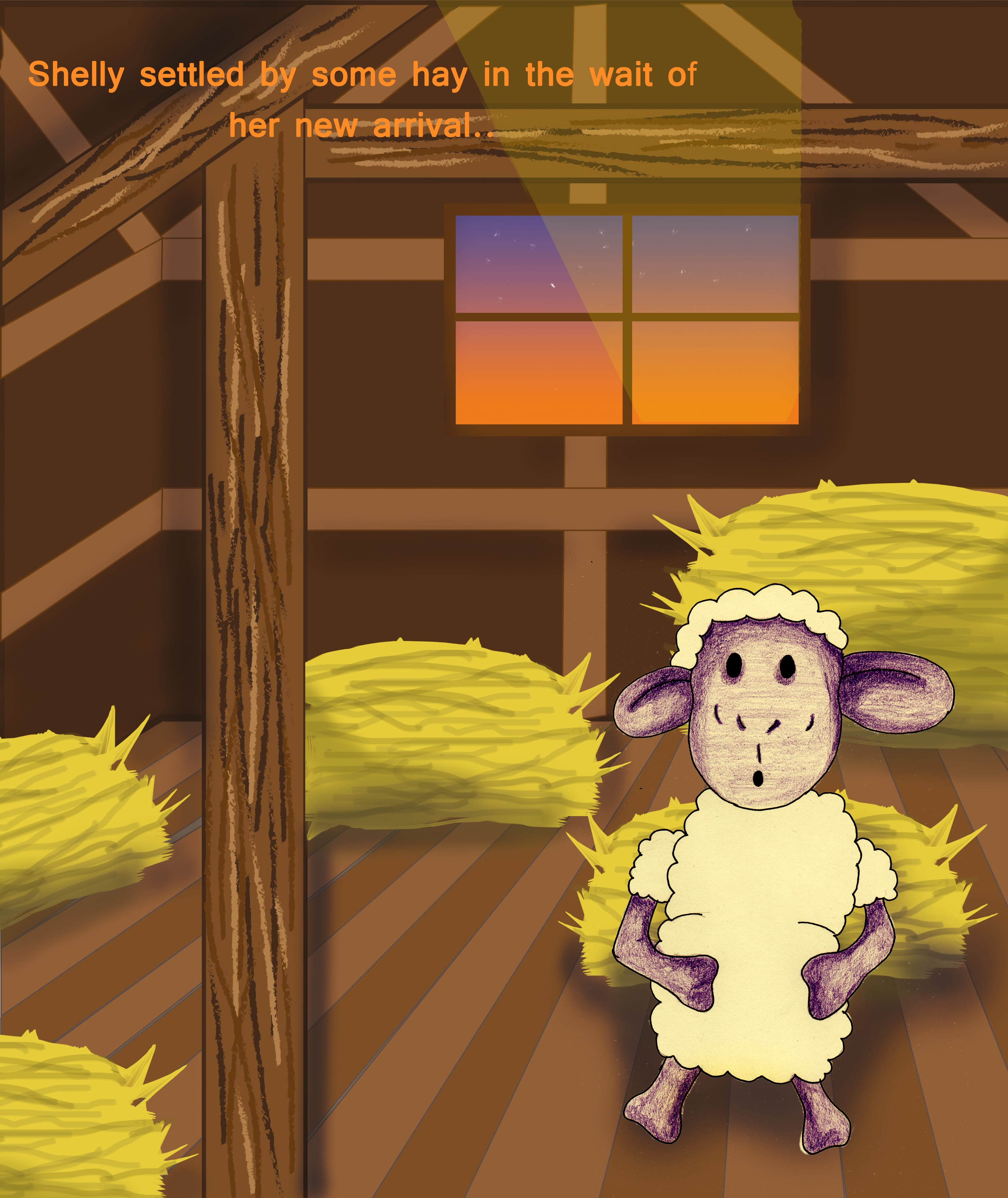
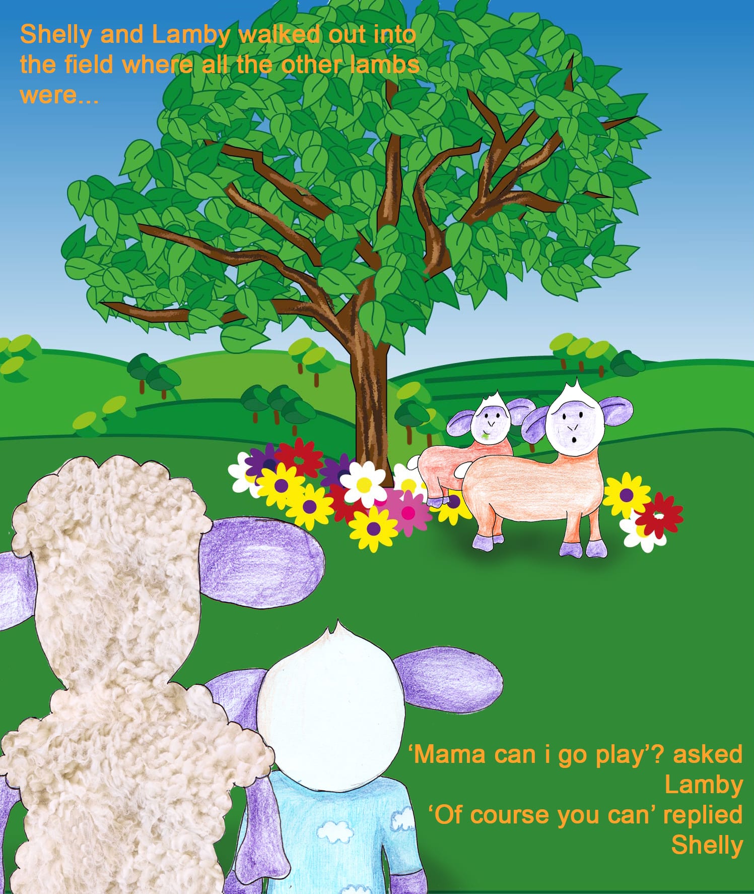
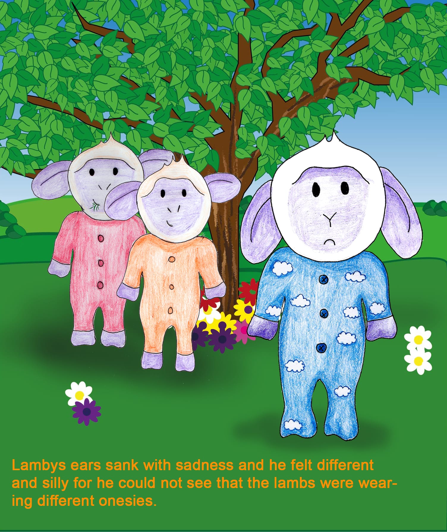
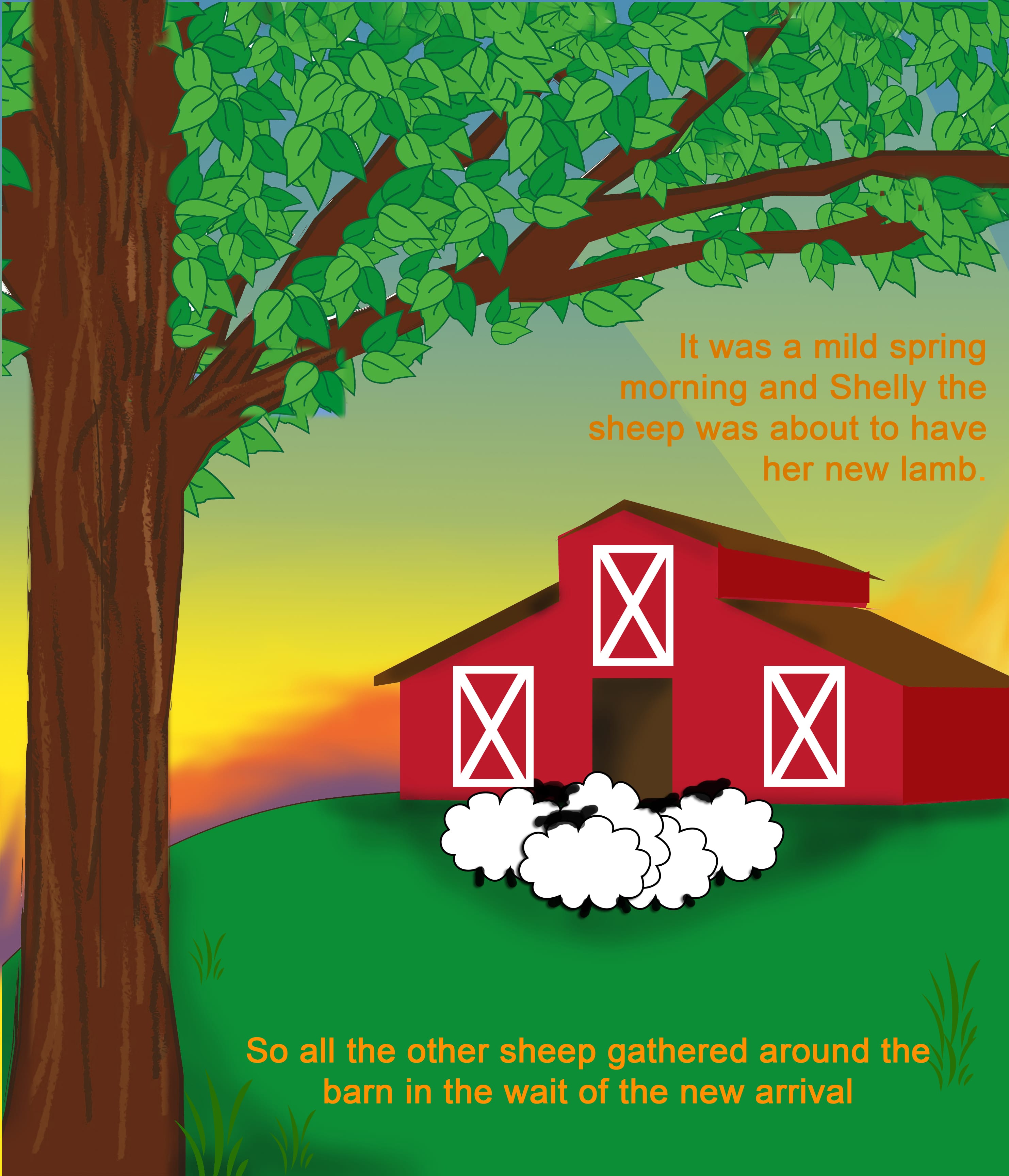
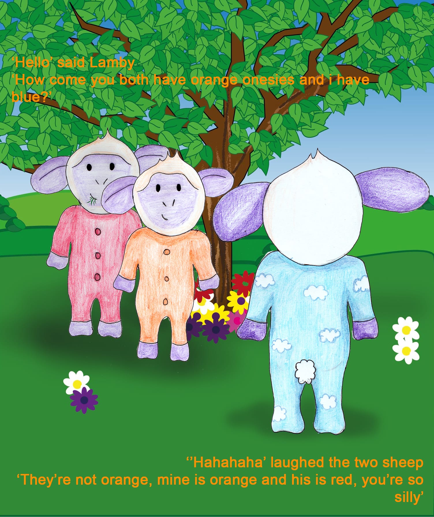
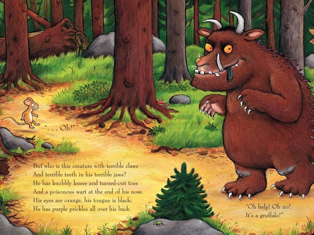
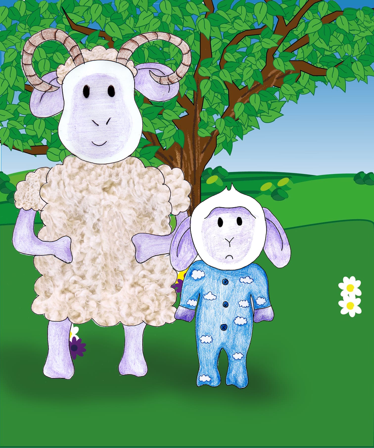
The children’s book is my favourite brief as it allowed complete freedom. My topic was about a lamb that is colour blind therefore feels isolated and sad because he knows he is different and all the lambs leave him out. The subject matter therefor being educational about colour and testing for colour blindness in children. The age range I have targeted my book at is for 4+ I chose this because from talking to my younger cousin, he learnt colour when he was 4 and that was the age he started recognising different colours therefore I feel this is an appropriate age. I left it open because some people don’t discover they’re colour blind until they’re much older and so it is targeted towards 4+. Although the theme of this book could be more suited for 3-7 just because it’s simple and more for younger children. The style of my book was inspired by the Gruffalo, with the idea of everything being hand drawn. However for my book, I made the sheep hand drawn but I digitally drew the scenery as I feel it looked better. I also did this because I wanted to expand my skills for drawing on Illustrator. My favourite pages of the book are the front cover, the stable scene and the scene where Lamby is sad with the other lambs in the background. They’re my favourite because the compositions work well and the digital drawing is good on my terms. The colours I chose were related to my favourite colours as a child, for example I loved Shaun the Sheep and anything summer related to do with fields and so I reflected this in my book. The stable scene was inspired by the film Barnyard but also reflected some Christianity with the lamb being born in a stable. The colours are all bright and complement each other, I also used certain colours together that I knew were difficult for a colour blind person to see. Therefore showing that this book test for colour blindness. The aspects of my book that I wasn’t so keen on are the scenes with Larry and the page where Lamby and Shelly step out into the field. I feel like these could’ve of been more creative and had a better composition. I will probably edit these in the future to look better.